Color and Value
I’ve been taking an Illustration 101 course recently offered by Tara Larsen Chang at Cloud 9 Art School. It’s been fascinating and it’s been fun to geek out with the latest topic of color.
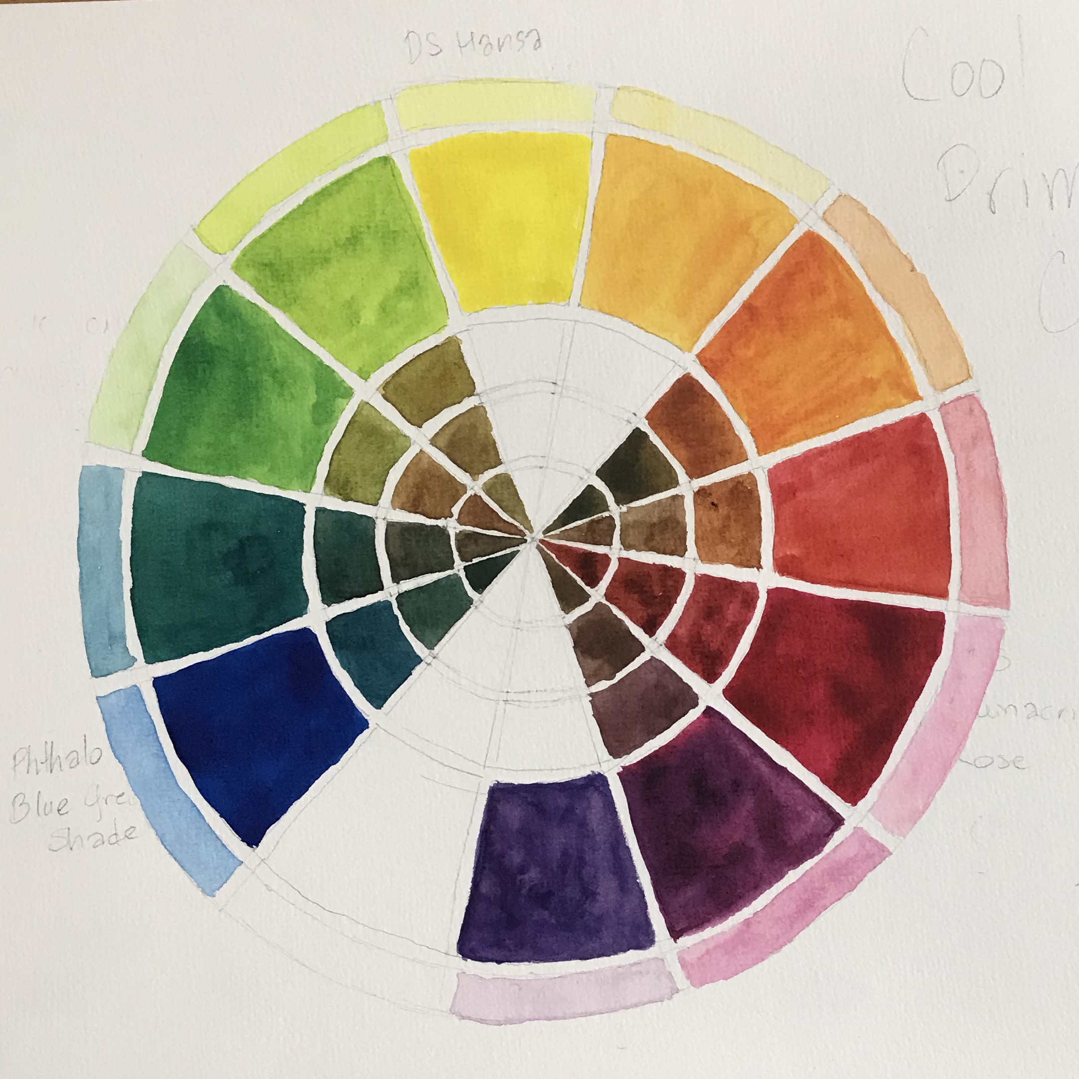
One of the recent exercises was to make a color wheel with primaries (Red, Yellow, and Blue), Secondaries (Orange, Green, and Purple) and Tertiaries (the colors between the Primaries and Secondaries). But part of making a strong picture is choosing the right values. As long as the values work, it doesn’t matter what the colors are.
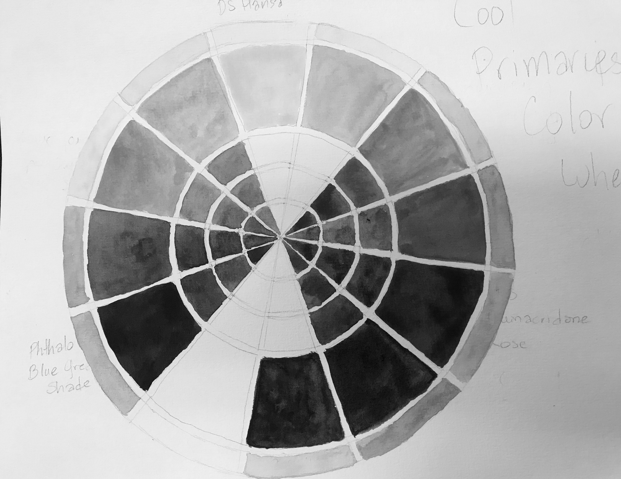
Above, the right picture is just making a black and white version of my color chart on the left. What’s fascinating is seeing how similar in value some colors are (the yellow green and the yellow-orange as well as the blue, red (rose), and red purple). It is very hard to look at colored things and assess their comparative value. With enough practice it can be learned though and getting a start on that is part of my next six-month plan!
Pyramid Color Chart of Yellows with Transparent Pyrrol Orange
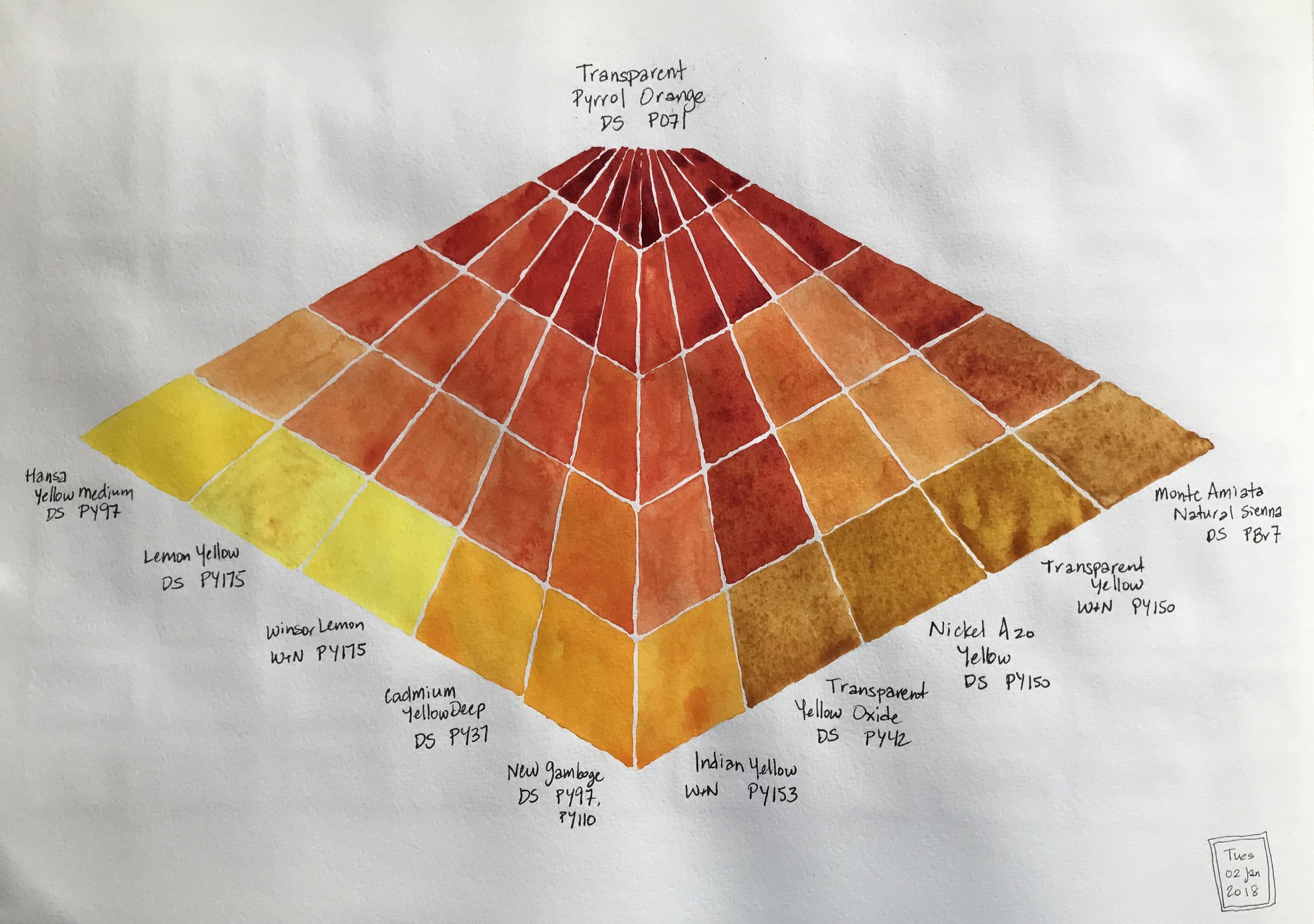
I now have a pyramid watercolor chart which is a quick visual summary of my favorite yellow mixes with Daniel Smith Transparent Pyrrol Orange. I had done 18 mixes and chose these ten. I did not include DS Hansa Yellow Light and WInsor & Newton Yellow Ochre in the chart since they are already part of my permanent palette.
A new color chart
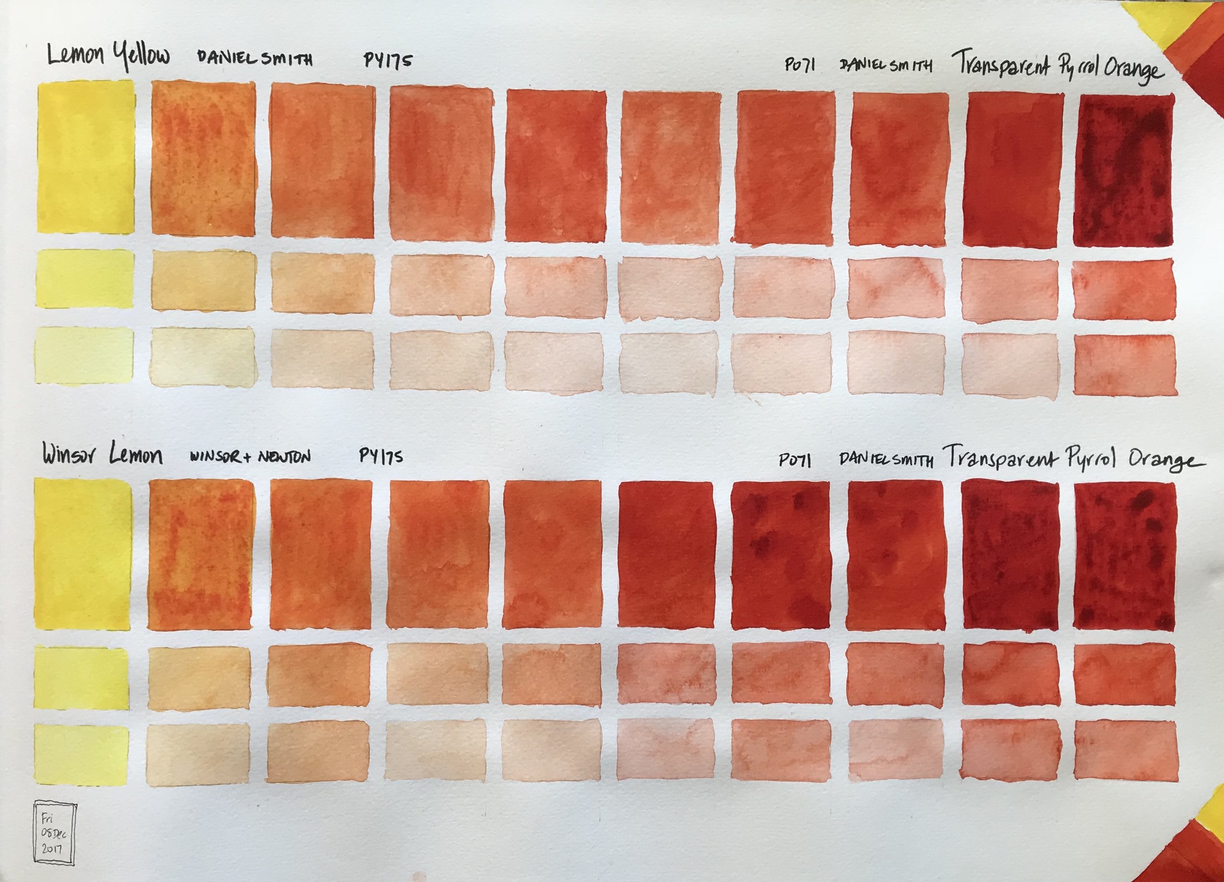
This chart is a comparison of the same pigment of PY175 as prepared by two manufacturers, Daniel Smith in their Lemon Yellow, and Winsor & Newton with their Winsor Lemon, mixed with Daniel Smith's Transparent Pyrrol Orange. In this case there's not much of a difference. The only difference I notice is for Lemon Yellow in the center where the mix is lighter in value than the chart below's corresponding box. I didn't start with as much Transparent Pyrrol Orange pigment to make my mixes and was running out in my Lemon Yellow - TPO chart.
Color Charts - Just because they make me happy!

I've started a new large sized Moleskine watercolor sketchbook and I plan to just have watercolor charts and various mixes in it. It is a huge book, 16 1/2" x 11 3/4"/42cm x 29.7cm, especially when open. It's a bit awkward to work in, but each page is so satisfying when complete. Prints will be available for purchase.
This page has Hansa Yellow Light, a cool yellow, and New Gamboge, a warm yellow, mixed with Transparent Pyrrol Orange. The original color is in one of the most right or most left tall rectangles. The mixes between the two colors move gradually towards the center of the page. The smaller boxes below each tall rectangle are with that particular color with some water added and then more water.
Color Chart to Test Possibilities

I had a trip coming up and I wanted to flesh out my existing travel palette from its existing nine colors to twenty. I have several versions of various hues made by different manufactures. I have several tubes of the same color of yellow, Hansa Yellow Medium. How different is that from my more regular Hansa Yellow Light? What would make for a variety of greens, good sky colors, and colorful walls, and flowers in the garden? This is a color chart testing out 19 hues.
Color Chart
This is a color chart from a limited palette of 9 colors that I was trying out for a travel palette: 2 yellow, 2 reds, 2 blues and a neutral color from each of those color families. I like the concept, but not quite this mix. I've found another empty palette that I can squeeze 20 half pans into and I'm now testing those color mixes to see which ones I'd like to add to and switch out from these nine shown above. I definitely need and want a cobalt teal or turquoise, a pink and a bright purple.