
Avoiding the Siren Call of the Shiny and New (also Known as Procrastination)
I was distracted today by temptations of what kind of art to do. So many choices, so little time. Which to do first? A friend has shown some watercolor abstracts she’s been doing and that seems a lot of fun to explore.
Another person on Facebook shared a pencil drawing of a stack of some lobster pots along a pier that he’d been working on. The detail and complexity seemed delightful to get lost in. I have pictures from Maine that I could use.
I have two books that I want to start working my way though: Modern Watercolor Botanicals by Sarah Simon and Pen & Ink Drawing, A Simple Guide by Alphoso Dunn. Both seem like they will be great as I improve my skills in watercolor and ink working through their practice examples.
So many interesting things to start and to explore! I’m sure you know that feeling of excitement and anticipation before a new project. It’s going to be so much fun!!
Then I looked at my list of artistic to-do’s which sit on my desk languishing waiting for my attention. Sigh.
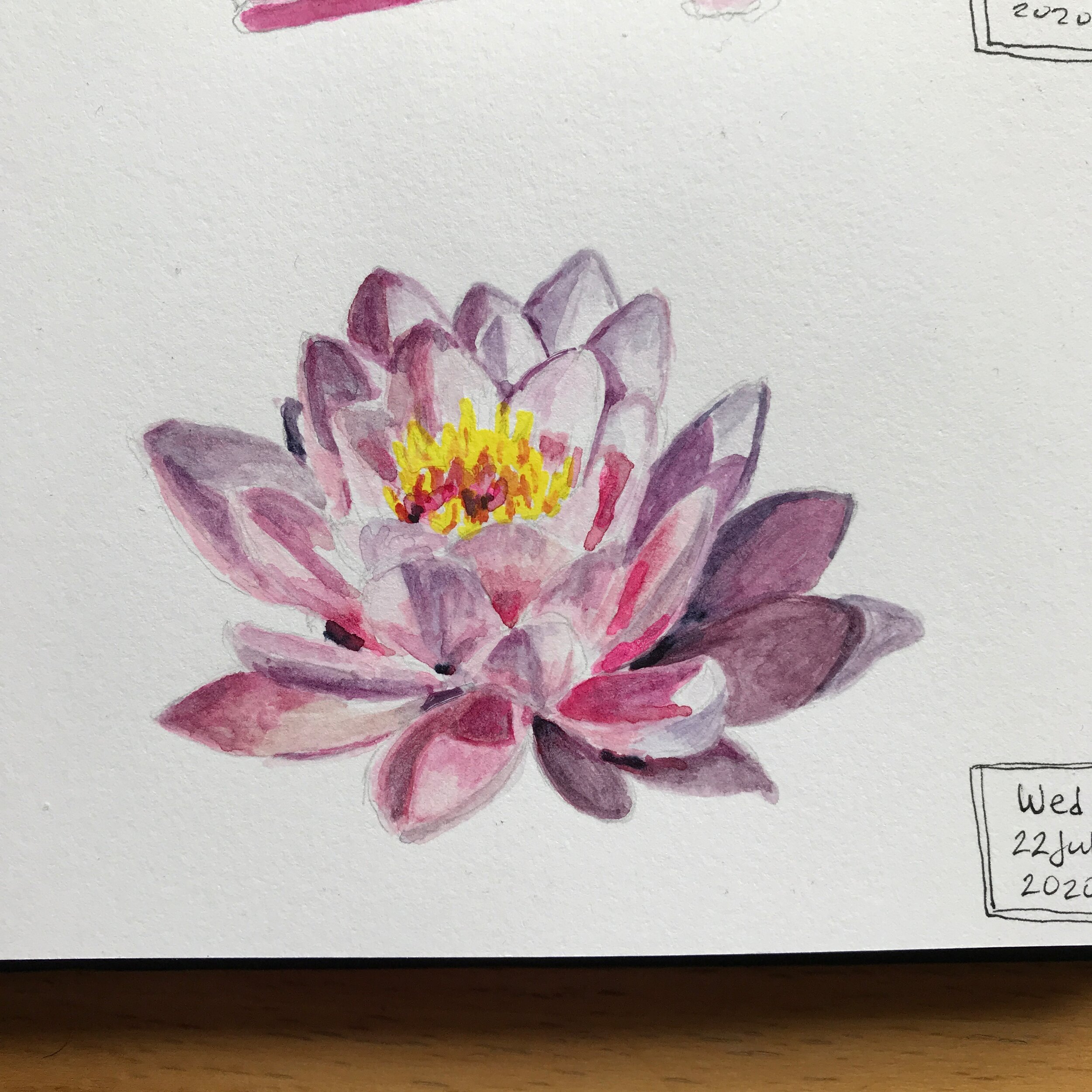
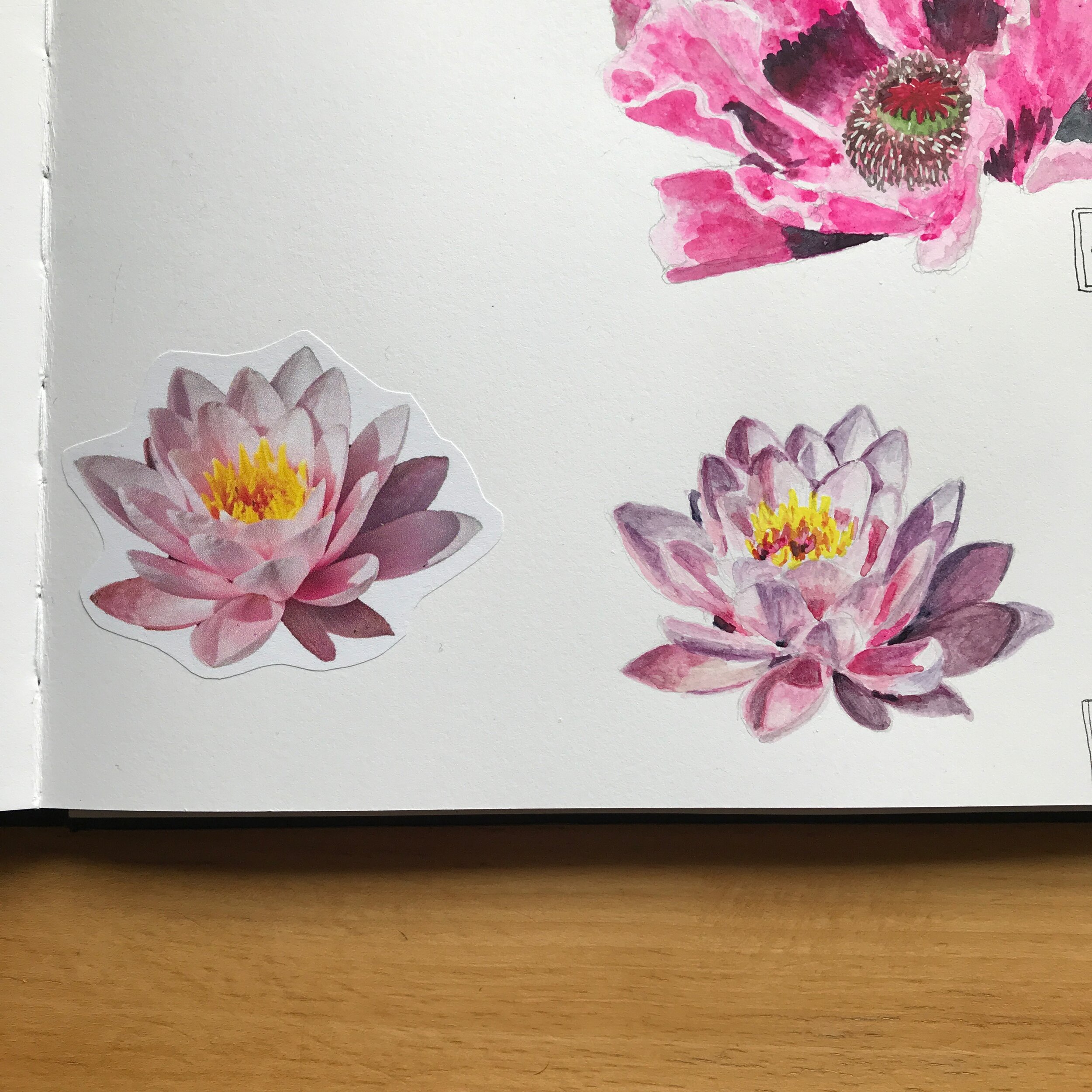
I ended up deciding to work on one of my older projects first before the shiny and new ones. I set a timer and started it so I had to start working. What I found was that in settling down and focusing on my project, my interest was piqued and I got involved and caught up in working on what was in front of me. I got caught up in the petals of this water lily: what colors to use, how much water, how can I blend the colors more, where do I need to add more value, etc. And then before too long, I finished it. One project done. Easy.
That’s the way it often is; once I put my attention to something, it becomes fascinating and I’m usually happy that I spent some time with that thing. I didn’t spend that much time, only about 30 minutes, but I got the added satisfaction of knowing I put off procrastinating and now I am free to start in on one of my new ideas. Now the decision making isn’t procrastinating but is enjoying the process of making a choice.
How do you get yourself to stop procrastinating?
Starting is Better Than Not
Today marks the end of an amazing workshop that I’ve been part of for the past 150 days, The Creative’s Workshop. Creatives of all types and persuasions, from so many different areas of interest and parts of the world gathered daily to share parts of their process and gave us windows into their worlds. There were poets, writers, podcasters, photographers, film makers, musicians, cartoonists, and visual artists to mention a few broad groups. It was so interesting and inspiring and a bit mentally exhausting - but in a good way.
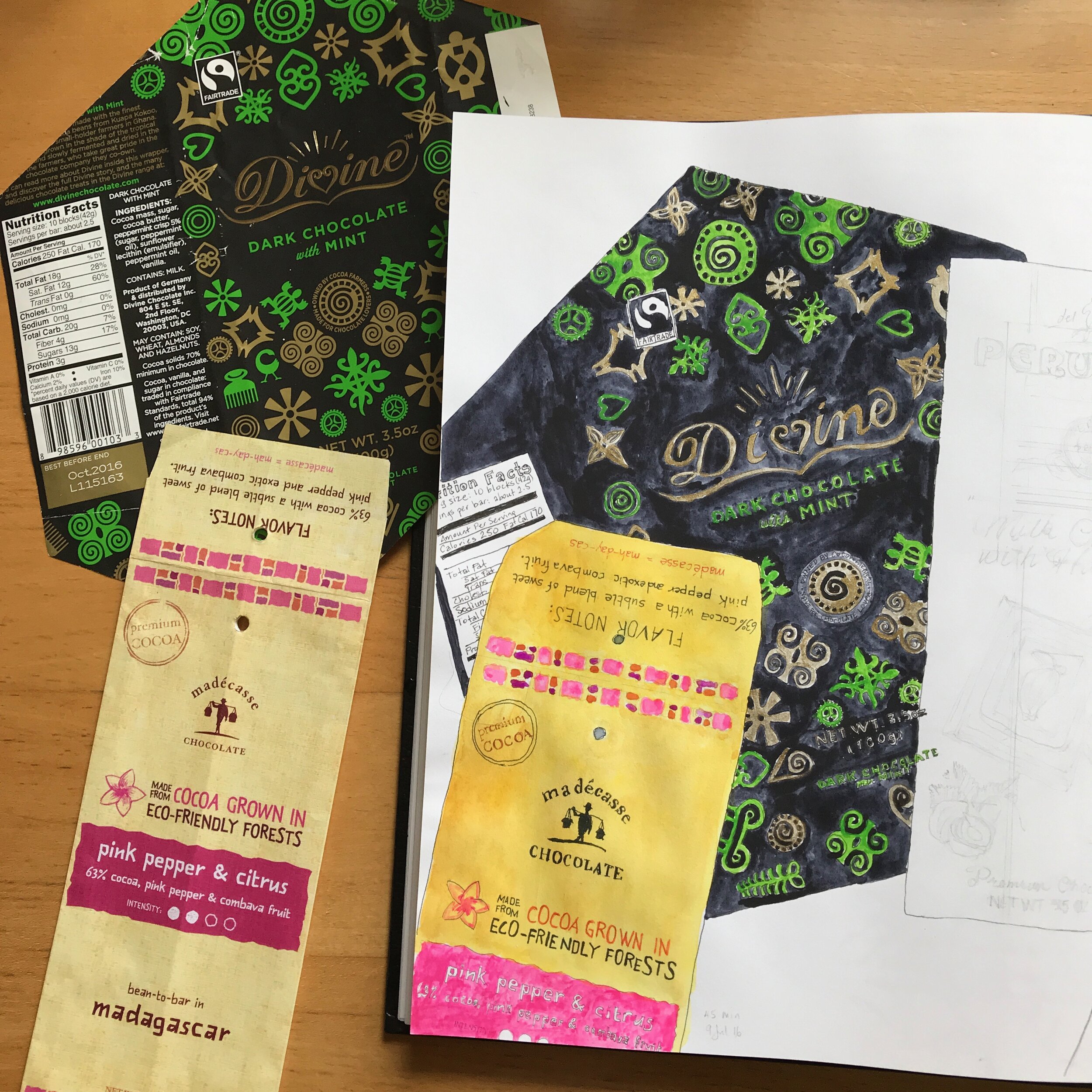
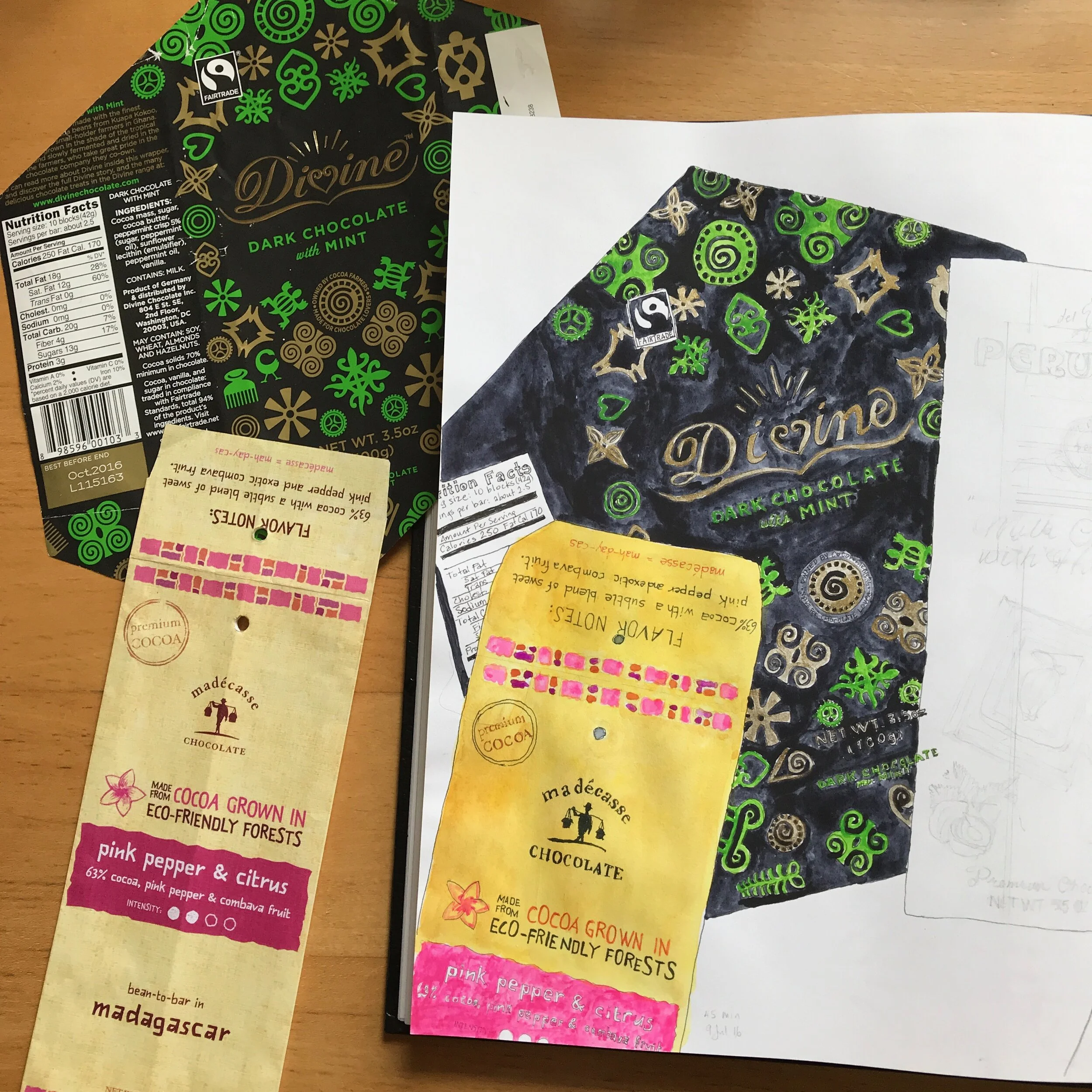
Progress made on a couple of chocolate bar wrappers
The workshop encouraged us to contribute something, anything, daily for 100 days. Many made it daily to the end. To ship something was better than not. Another way of saying that is to start before you’re ready.
I was inspired at the very end, this morning in fact, to start writing a blog and to add something here daily. I’m hoping that by doing this I will move closer to being me rather than who I think I’m supposed to be.
So here I am, starting before I’m ready. The blog page doesn’t look the way I want. I don’t have a well thought out plan for what I want to do or a specific goal by a specific time. I know, however, that saying things out loud even if no one reads this blog allows me to work off my ideas and be able to then change and edit and nudge new ideas out.
Pressing the “Save & Publish” button now!
Watercoloring a Seal from the Antarctic

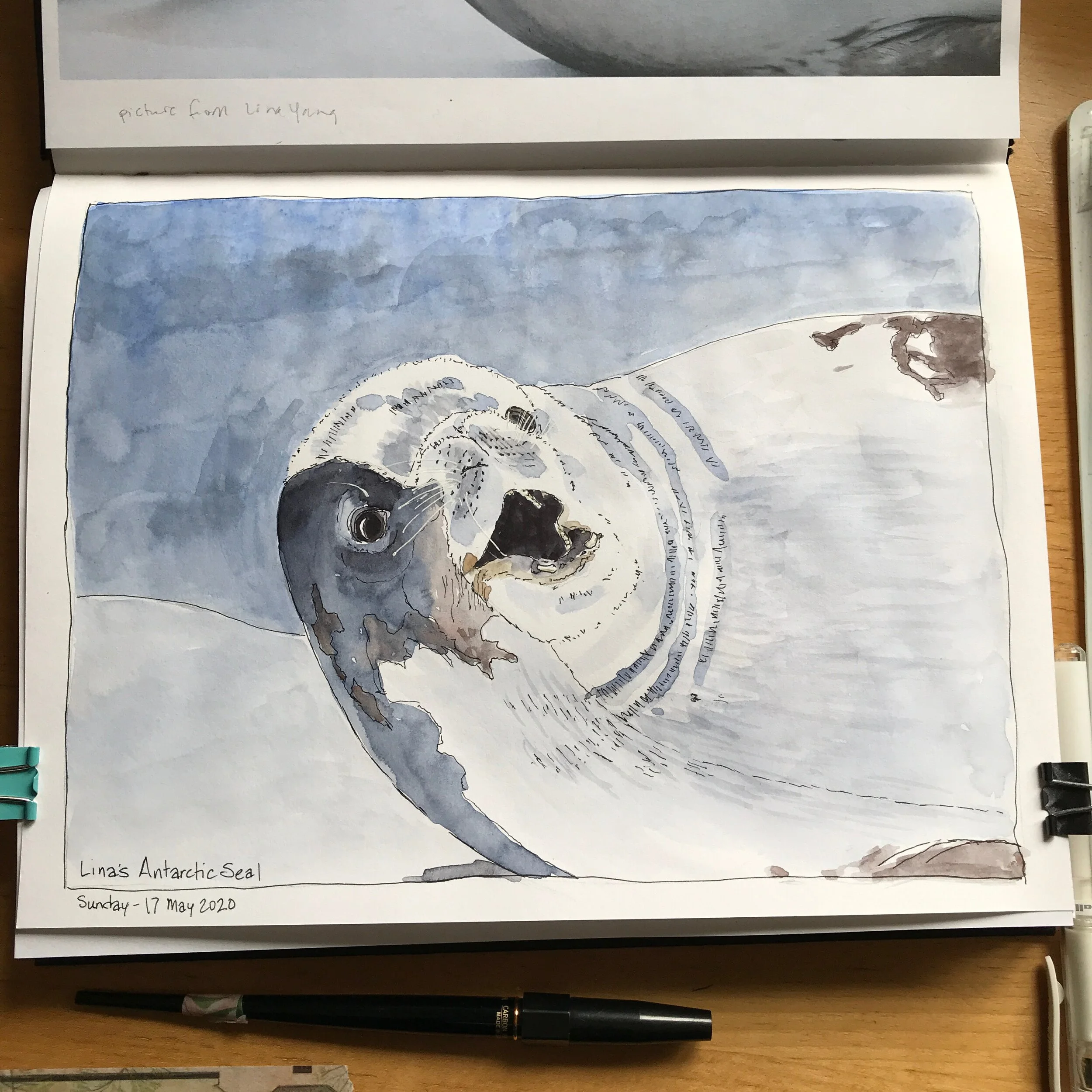
An Antarctic Seal in Ink and Watercolor
Have you ever seen a photo and been inspired to try to draw or paint it? This is my effort after seeing one of my friend's pictures from a trip she took to the Antarctic. I loved one of the seal pictures she had and she kindly shared the photo with me so I could give it a try.
As you probably know, I work in sketchbooks and do something in one of them everyday. I'm a big believer in keeping and honoring having a creative habit. Working on finishing up this drawing of the seal was today’s effort. I also filmed my painting process and turned that into a video. I have other drawing and painting videos up on my YouTube channel as well.
The video condenses 40 minutes of drawing and painting time into about 6. The seal is done in ink and watercolor. I did the inking of the seal earlier in the week.
The sketchbook I used is a Stillman & Birn Alpha. The watercolors are from Daniel Smith.
The music in the background is At Midnight by Rupert Sachs and At Last Part II by Martin Landh.
https://youtu.be/8Sb6Ns_nBS4
Procrastination - Starting's really not so bad!

Botanical watercolor of a tulip.
My botanical watercolor of a tulip is all done! I’m very pleased with both how it turned out and also for getting it done. I have so many unfinished drawings in my sketchbooks that part of what I’m doing with my dailies* is to work on some of them and get them finished before starting new drawings on empty pages. I’m hoping that will clear some of the clutter and distraction in my head.
What I found interesting about working on this tulip from a creativity point of view is how long I resisted and procrastinated working on it - 2 years. I was very good at coming up with excuses to avoid it. Many of my reasons had to do with color matching and blending colors. There was a lot of internal whining.
The funny thing was once I started, it was surprisingly simple and straightforward. Once I mixed a color and put it down, I could leave it or change it by adding another layer of color. It was that easy. And if I really messed up by spilling water across the page or big blobs of color got on the picture somehow, I could chose to continue or I could turn the page and draw it again and start over or not. The choices weren’t difficult but my mind before starting did a great job in over-complicating things.
Procrastination is all about fear but if somehow you can take a first step or action, then you have something to react to and make a decision on. It’s no longer the unknown. Progress is made.
What are you procrastinating on? How can you take a step forward with it? What will you do?
(* I am currently taking the online class, The Creative’s Workshop, and they encourage the participants to show up daily with something they’ve been working on. Rough and incomplete is fine. Just show up. I posted in the class for 4 days running with progress on this tulip.)
Color and Value
I’ve been taking an Illustration 101 course recently offered by Tara Larsen Chang at Cloud 9 Art School. It’s been fascinating and it’s been fun to geek out with the latest topic of color.
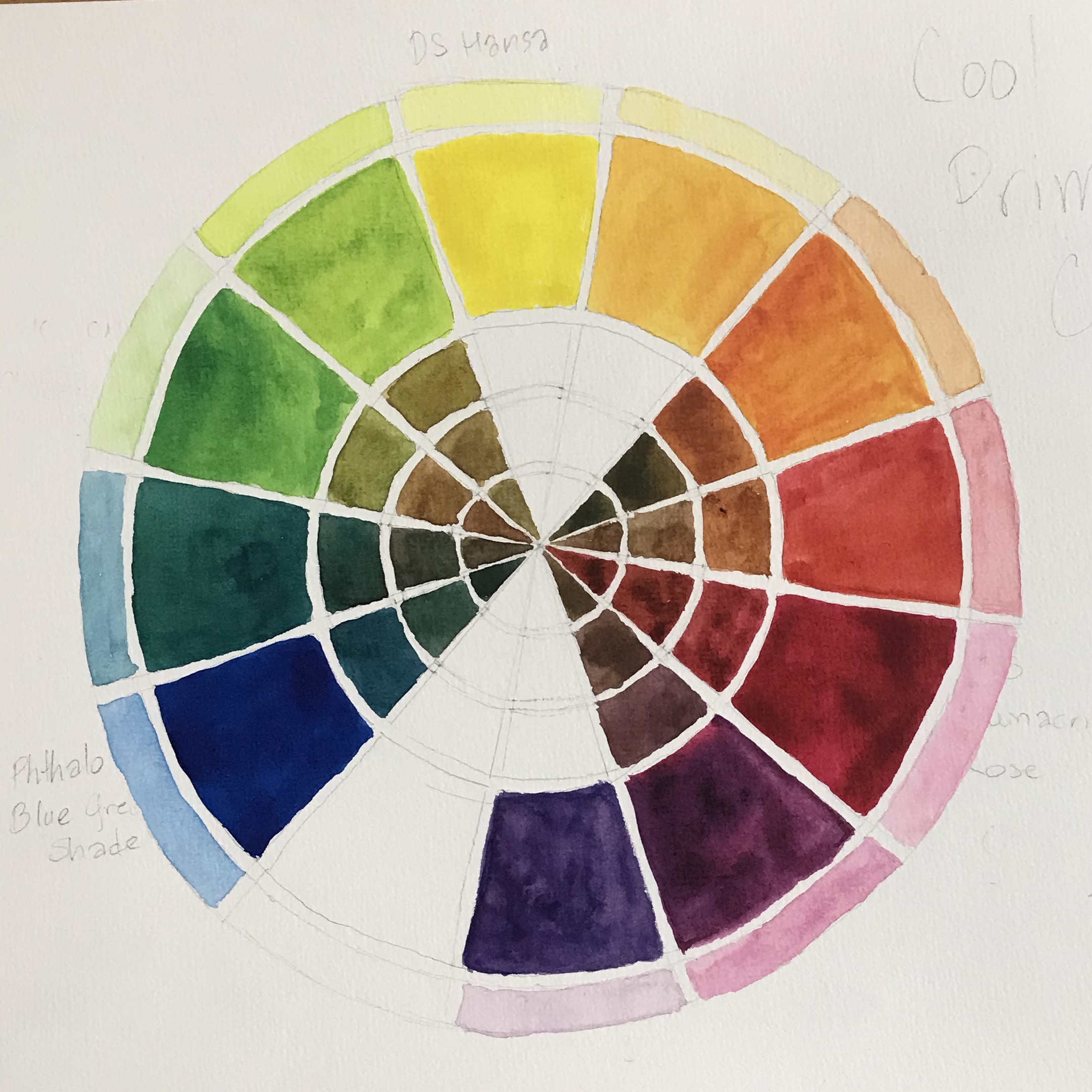
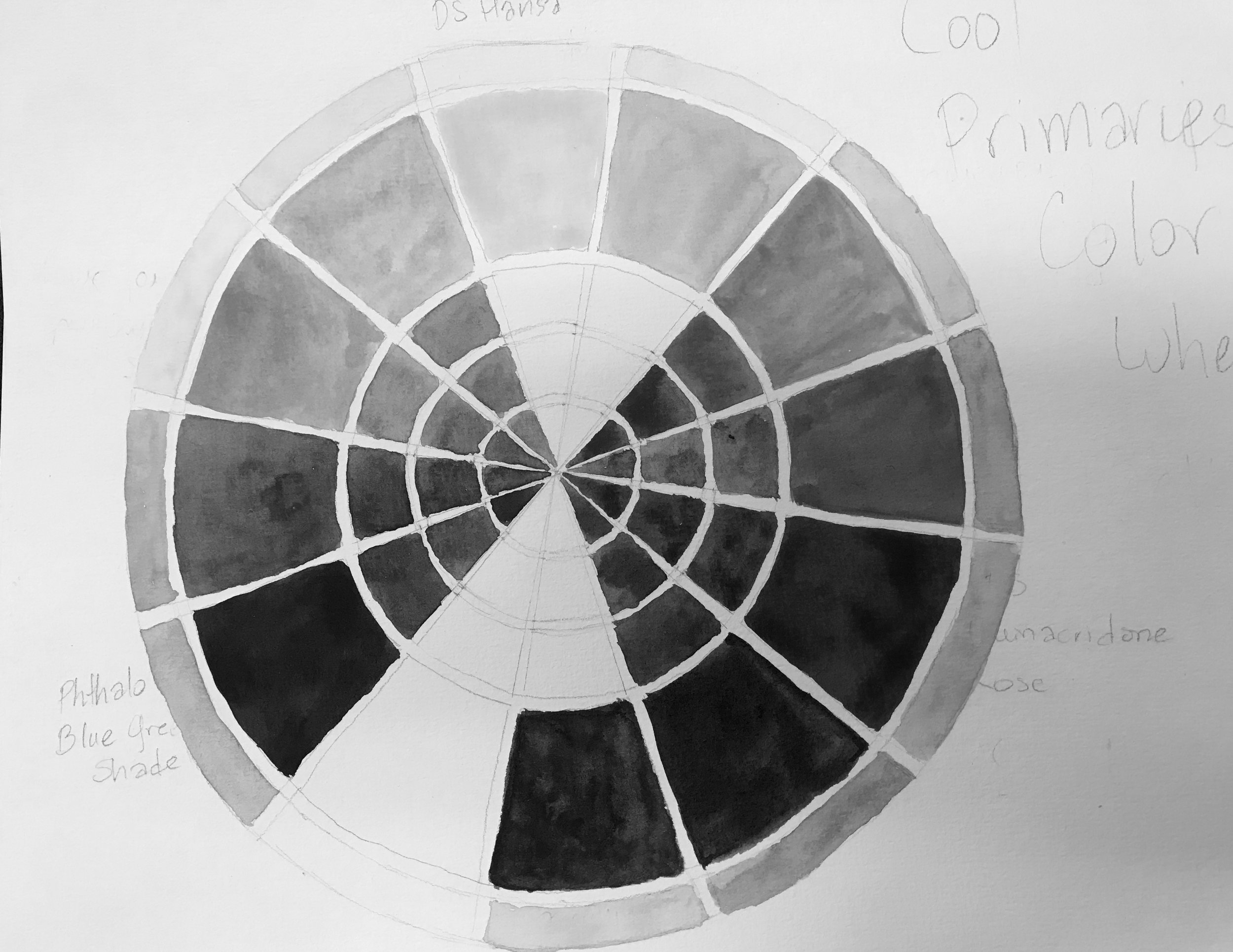
One of the recent exercises was to make a color wheel with primaries (Red, Yellow, and Blue), Secondaries (Orange, Green, and Purple) and Tertiaries (the colors between the Primaries and Secondaries). But part of making a strong picture is choosing the right values. As long as the values work, it doesn’t matter what the colors are.
Above, the right picture is just making a black and white version of my color chart on the left. What’s fascinating is seeing how similar in value some colors are (the yellow green and the yellow-orange as well as the blue, red (rose), and red purple). It is very hard to look at colored things and assess their comparative value. With enough practice it can be learned though and getting a start on that is part of my next six-month plan!
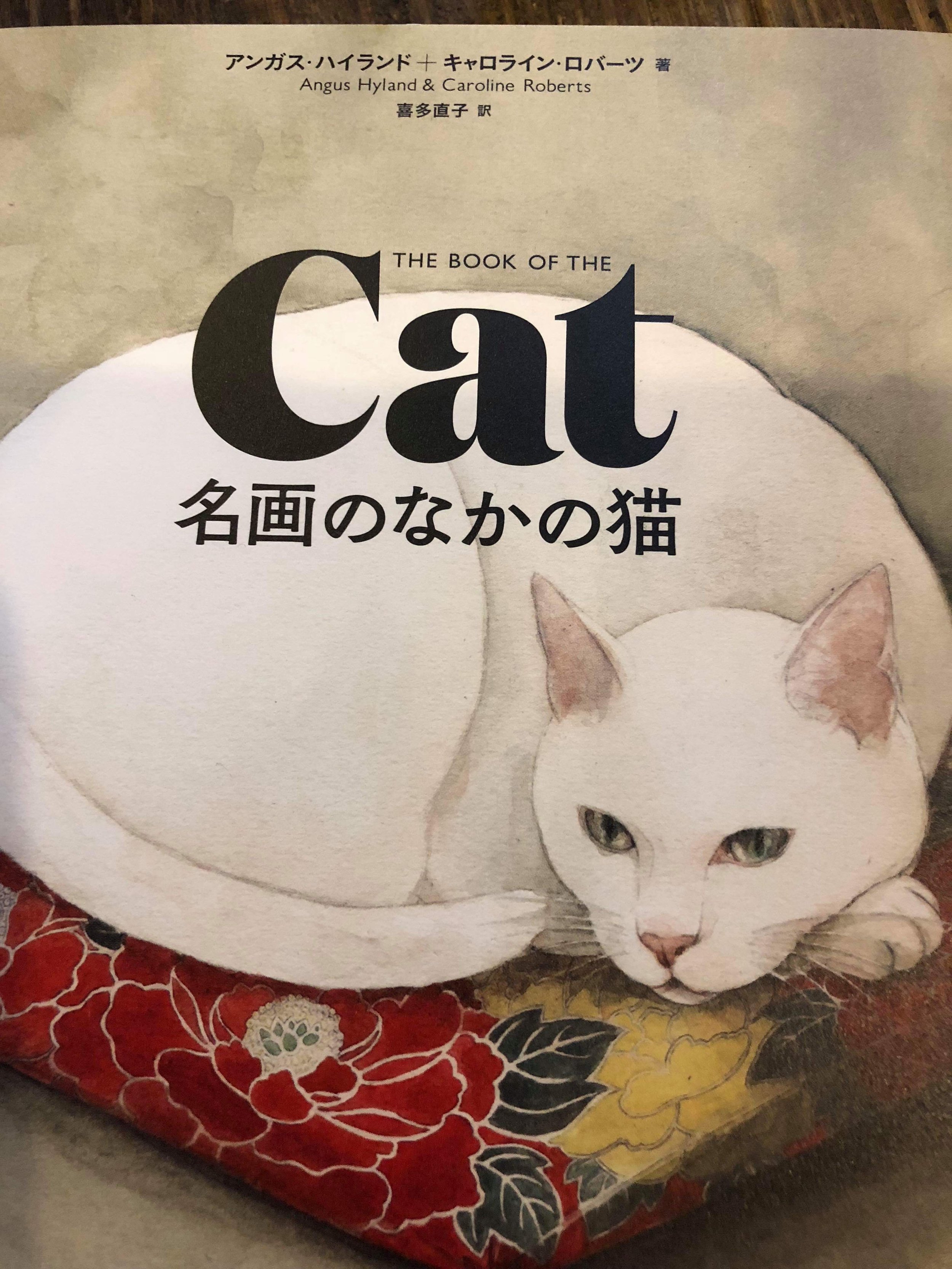
One of my cat portraits is going on a book promotion in Japan

My friend, Naoko Eric Kita, in Japan is a translator from English to Japanese. One of her latest books is coming out, 名画のなかの猫, translated from "The Book of the Cat." She is sending out promo cards to booksellers in Japan and my watercolor of her cat Sakura is on them. It’s kind of fun to be indirectly part of this project.
I’m available for pet portraits, but no promises that yours will end up on book promotions!
More color and color charts!
Recently I took an online course with Australian sketchbook artist and former architect, Liz Steel with her SketchingNow Watercolours course. She is an amazing artist and a very good instructor. I highly recommend her! I've taken several of her online courses and first came across her as an instructor in Sketchbook Skool, another source of great sketchbook courses online.
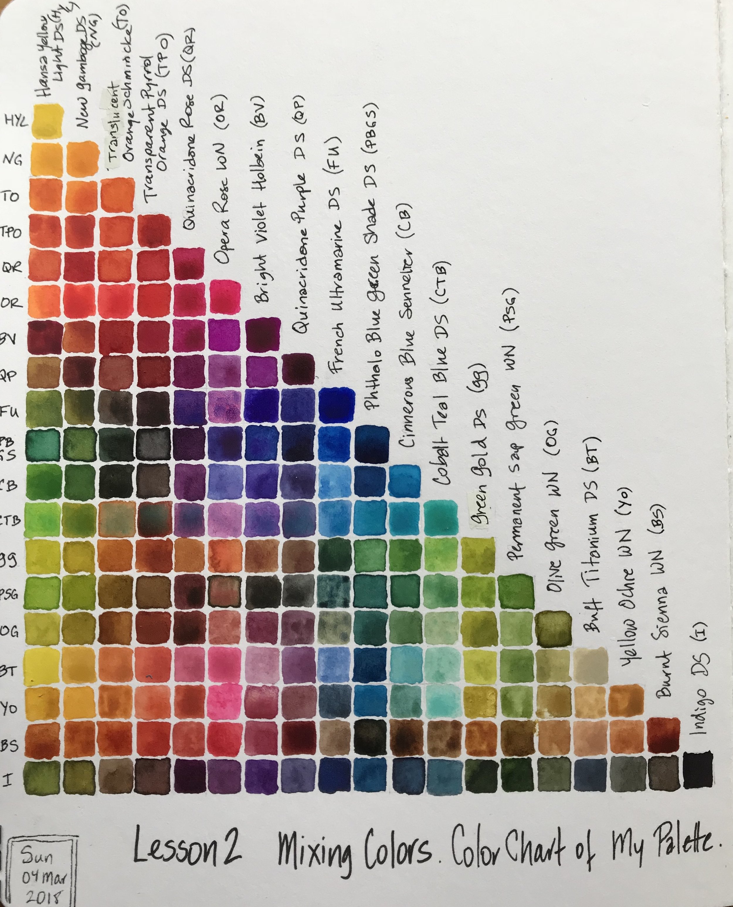
Liz led us through a variety of exercises with our watercolors to become more familiar with what our particular paints would do and things to consider when painting on location. One of the lessons was about mixing colors and the benefits of knowing certain combinations of color mixes before going on location so that when that kind of combination was needed it would be easy to mix rather than guessing. She suggested that we make a color mix chart of the paints in our palettes but it wasn't a requirement for the course since it does take a long time to do. However, I find making color charts a lot of fun and rather meditative, so here is my color mix chart of my current travel palette.
My paints are a combination of Daniel Smith (DS), Winsor & Newton (WN), Holbein, Schmincke and Sennelier.