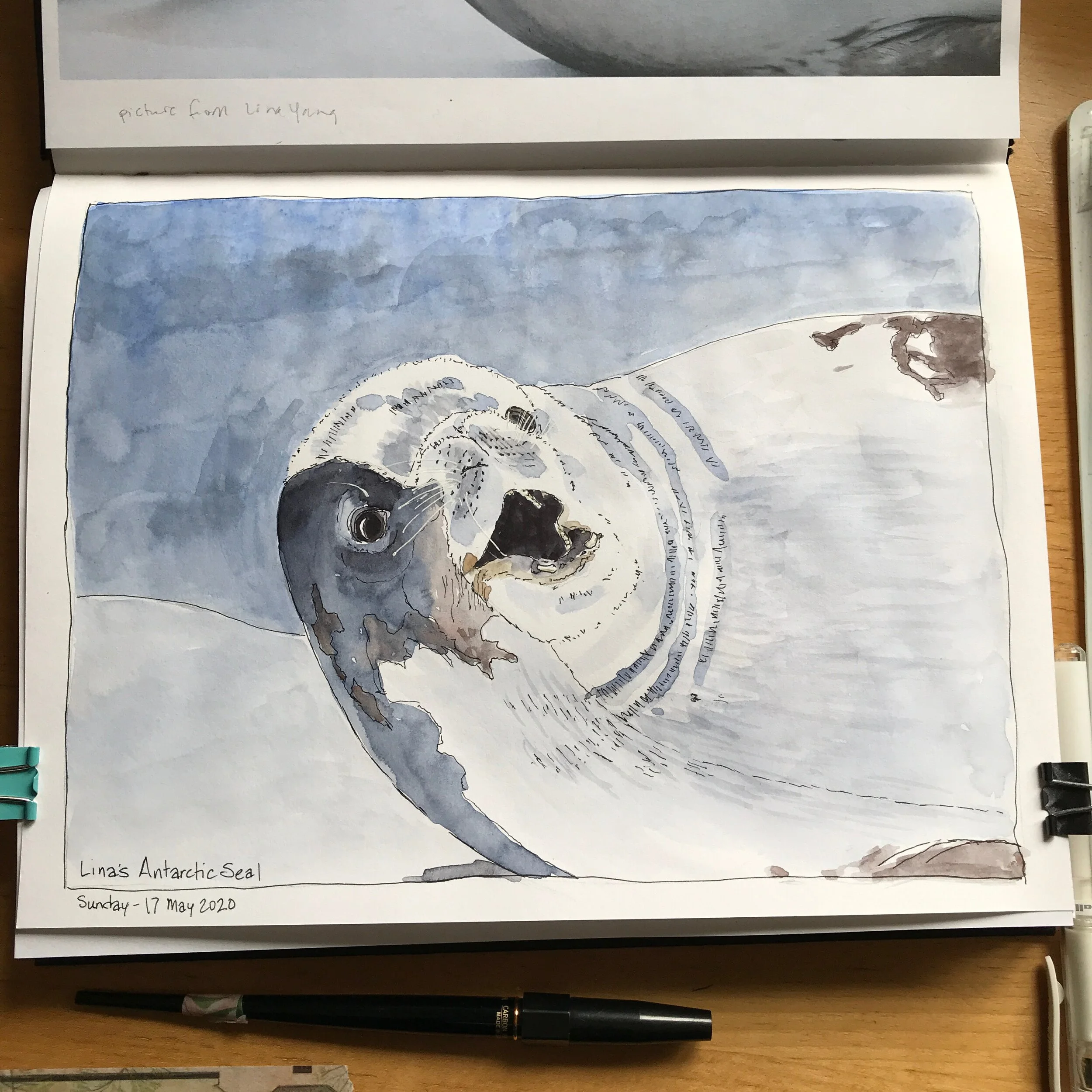
Watercoloring a Seal from the Antarctic

An Antarctic Seal in Ink and Watercolor
Have you ever seen a photo and been inspired to try to draw or paint it? This is my effort after seeing one of my friend's pictures from a trip she took to the Antarctic. I loved one of the seal pictures she had and she kindly shared the photo with me so I could give it a try.
As you probably know, I work in sketchbooks and do something in one of them everyday. I'm a big believer in keeping and honoring having a creative habit. Working on finishing up this drawing of the seal was today’s effort. I also filmed my painting process and turned that into a video. I have other drawing and painting videos up on my YouTube channel as well.
The video condenses 40 minutes of drawing and painting time into about 6. The seal is done in ink and watercolor. I did the inking of the seal earlier in the week.
The sketchbook I used is a Stillman & Birn Alpha. The watercolors are from Daniel Smith.
The music in the background is At Midnight by Rupert Sachs and At Last Part II by Martin Landh.
https://youtu.be/8Sb6Ns_nBS4
Pyramid Color Chart of Yellows with Transparent Pyrrol Orange
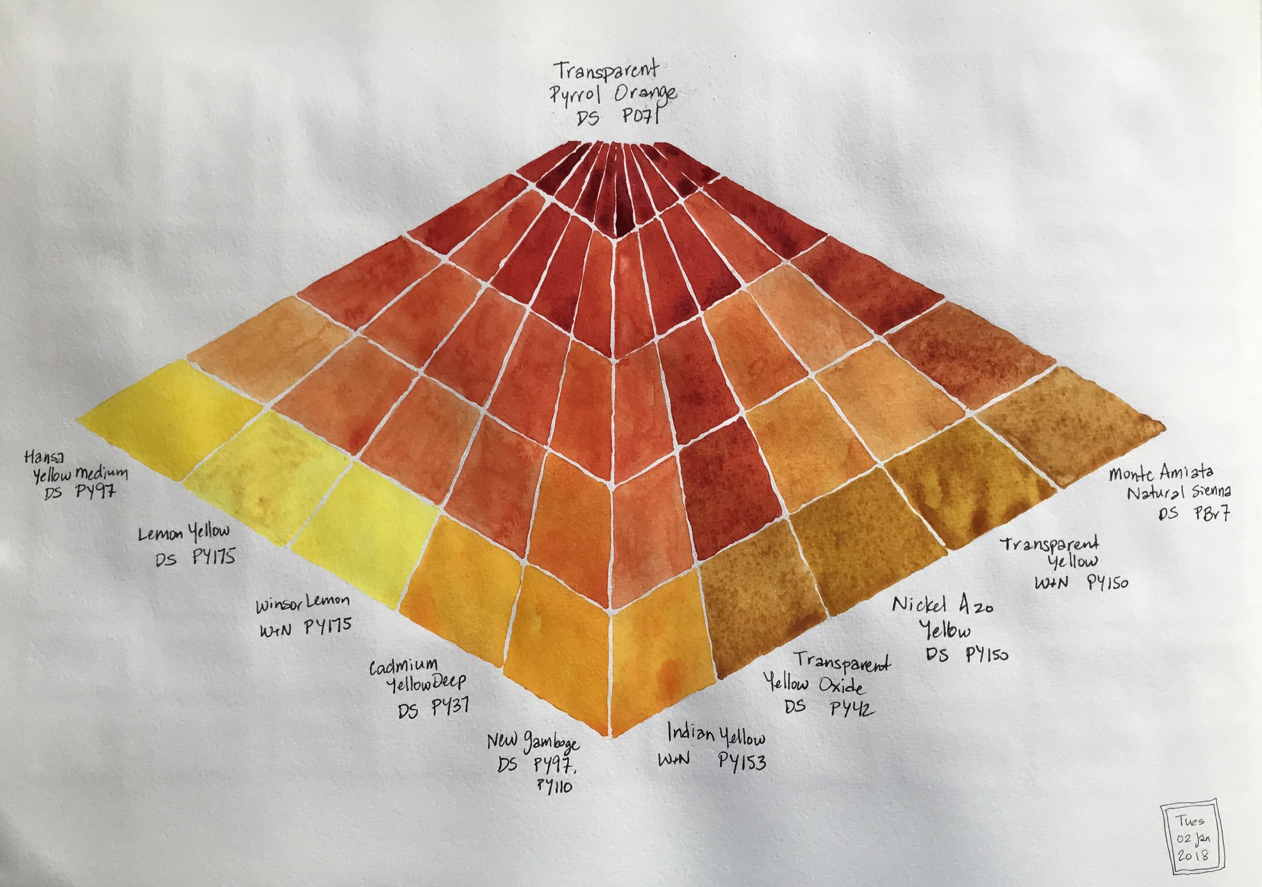
I now have a pyramid watercolor chart which is a quick visual summary of my favorite yellow mixes with Daniel Smith Transparent Pyrrol Orange. I had done 18 mixes and chose these ten. I did not include DS Hansa Yellow Light and WInsor & Newton Yellow Ochre in the chart since they are already part of my permanent palette.
My Current Travel Palette

No matter where you are in your learning path, it's always good to take classes to learn something new, refresh skills and be challenged to do things you wouldn't normally do. I am taking a class from Liz Steel called SketchingNow Watercolours that begins 10 Jan 2018. She does mostly sketchbook work and is a trained architect. She has a much looser and wetter style of painting than I do and I'd like to learn more of how she approaches watercolors.
Many artists like to take stock of their current materials and Liz is no different. She suggested that the students draw and paint out their current watercolor palettes and make notes of what paints are included. Here is my current set of mostly Daniel Smith, a few Winsor & Newton and solo Holbein, Schmincke and Sennelier watercolors. Palettes are so much more interesting painted out because the color can be seen. It's surprising how different a dry pan of paint can be from a painted swatch on paper.
A new color chart
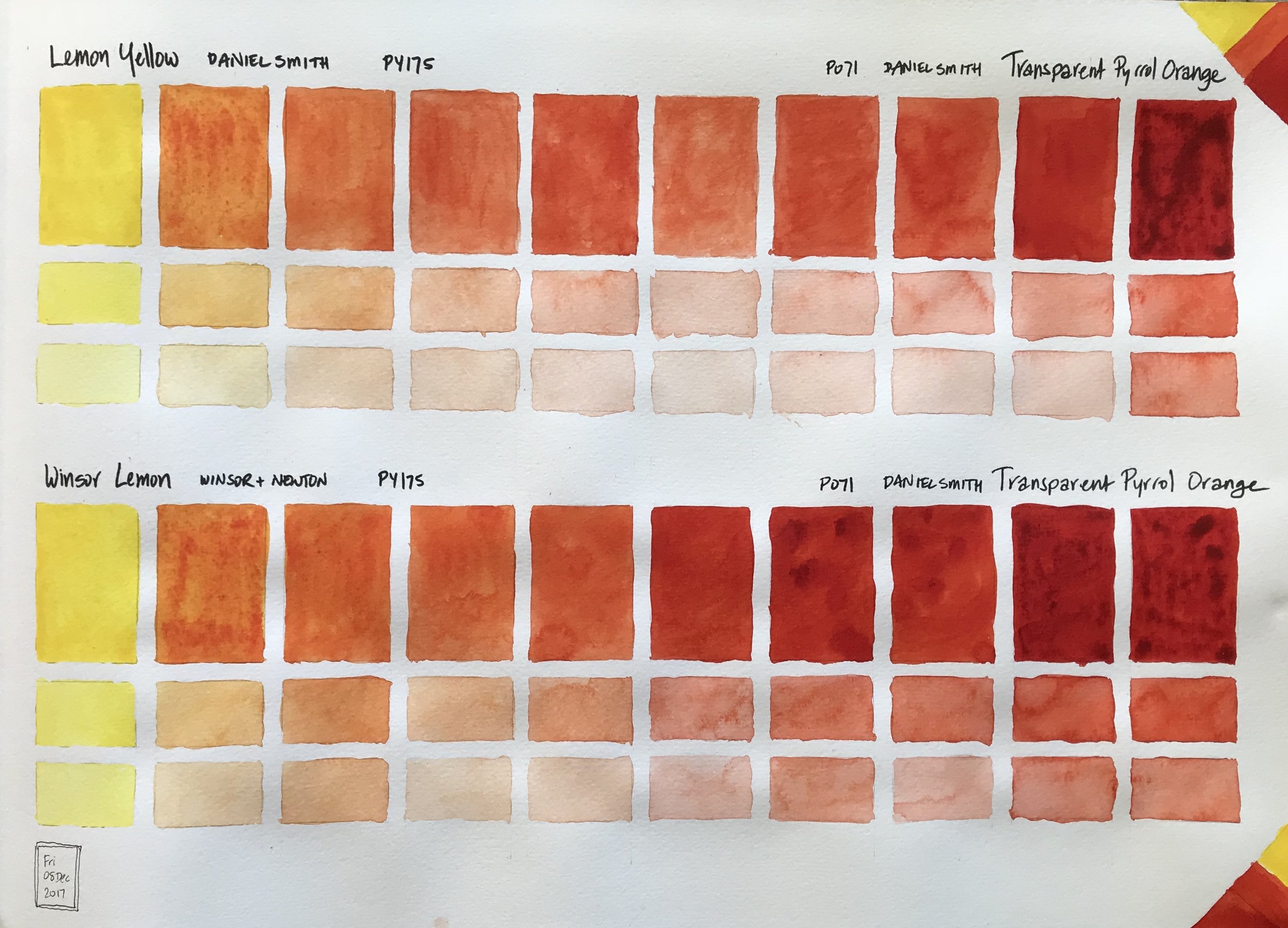
This chart is a comparison of the same pigment of PY175 as prepared by two manufacturers, Daniel Smith in their Lemon Yellow, and Winsor & Newton with their Winsor Lemon, mixed with Daniel Smith's Transparent Pyrrol Orange. In this case there's not much of a difference. The only difference I notice is for Lemon Yellow in the center where the mix is lighter in value than the chart below's corresponding box. I didn't start with as much Transparent Pyrrol Orange pigment to make my mixes and was running out in my Lemon Yellow - TPO chart.
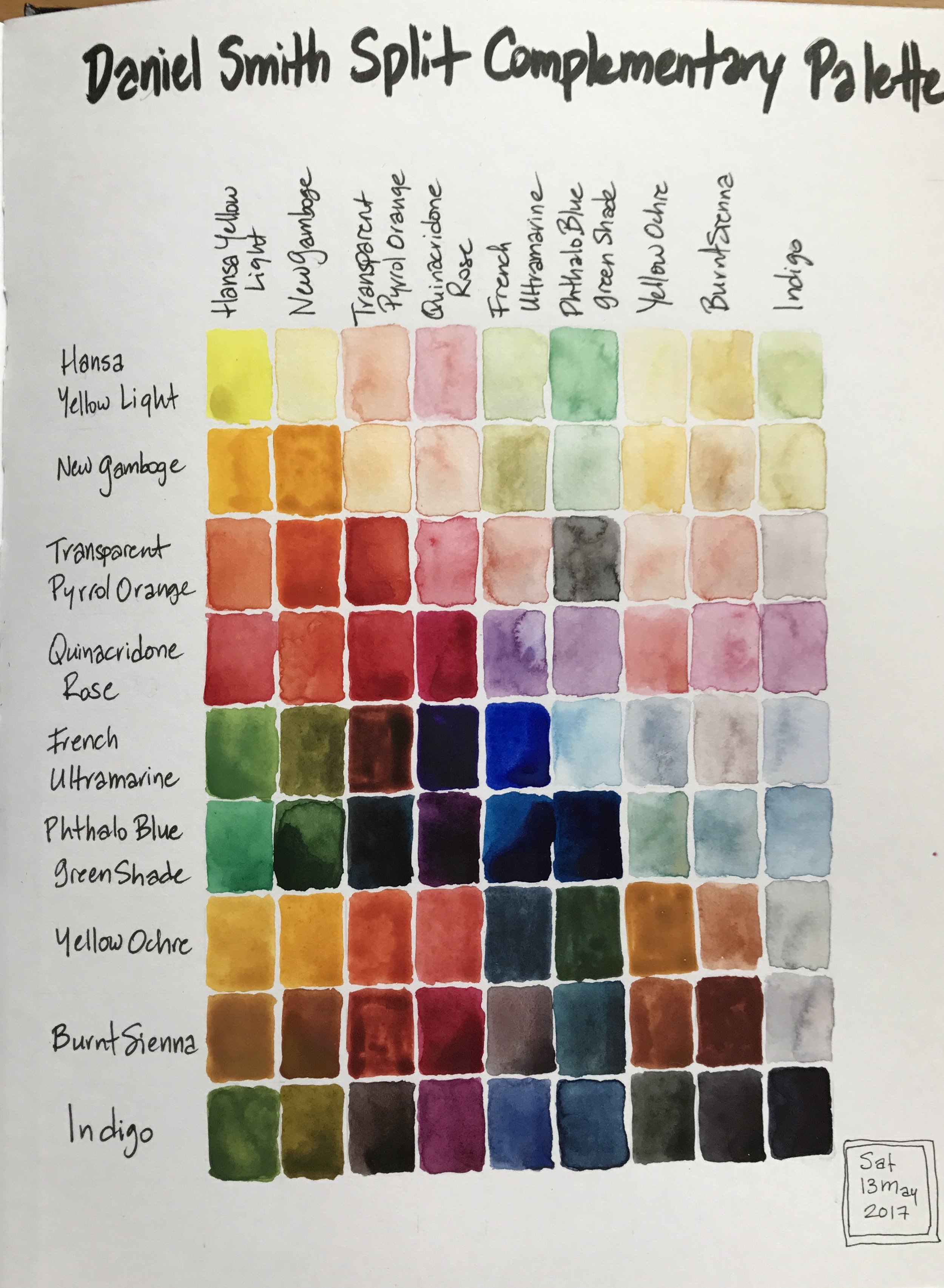
Color Charts - Just because they make me happy!

I've started a new large sized Moleskine watercolor sketchbook and I plan to just have watercolor charts and various mixes in it. It is a huge book, 16 1/2" x 11 3/4"/42cm x 29.7cm, especially when open. It's a bit awkward to work in, but each page is so satisfying when complete. Prints will be available for purchase.
This page has Hansa Yellow Light, a cool yellow, and New Gamboge, a warm yellow, mixed with Transparent Pyrrol Orange. The original color is in one of the most right or most left tall rectangles. The mixes between the two colors move gradually towards the center of the page. The smaller boxes below each tall rectangle are with that particular color with some water added and then more water.
Color Chart
This is a color chart from a limited palette of 9 colors that I was trying out for a travel palette: 2 yellow, 2 reds, 2 blues and a neutral color from each of those color families. I like the concept, but not quite this mix. I've found another empty palette that I can squeeze 20 half pans into and I'm now testing those color mixes to see which ones I'd like to add to and switch out from these nine shown above. I definitely need and want a cobalt teal or turquoise, a pink and a bright purple.