A new color chart
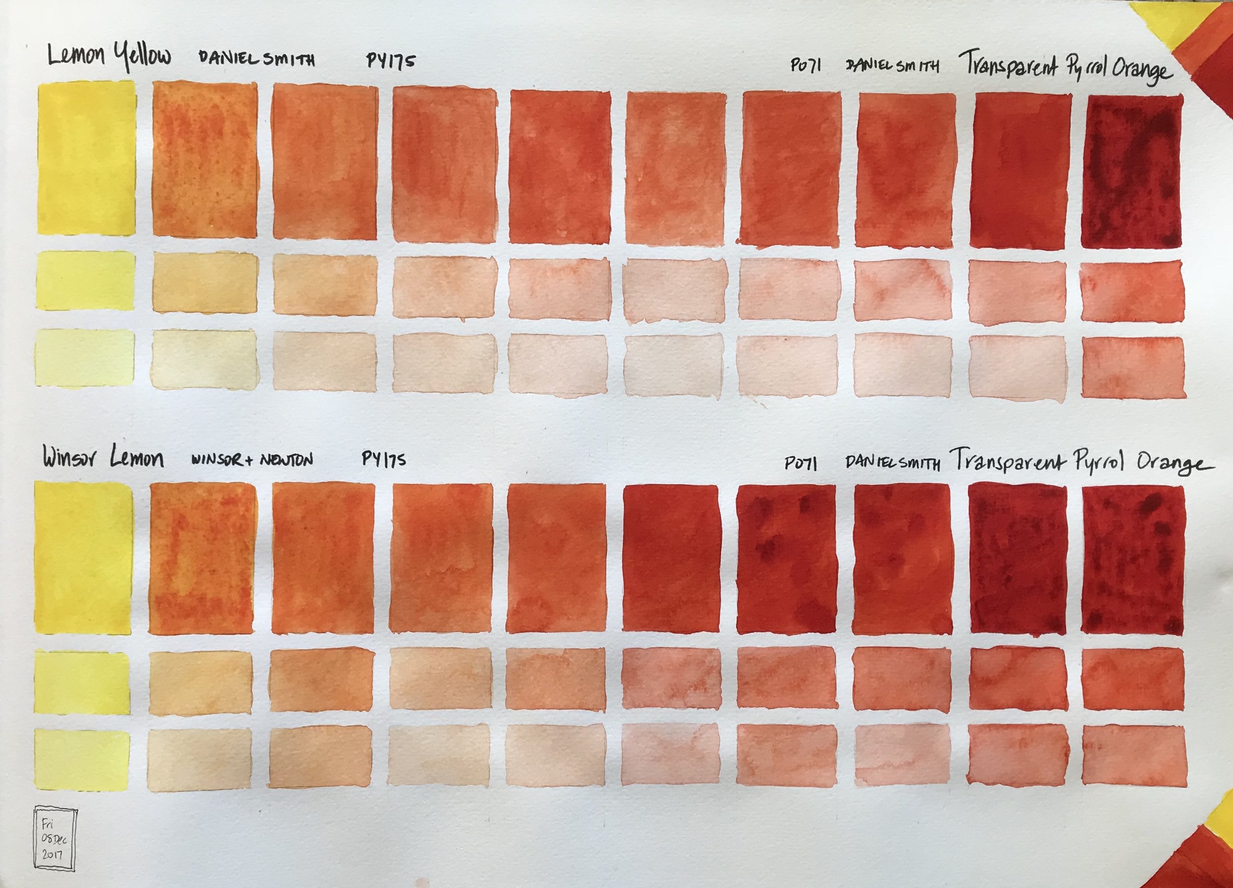
This chart is a comparison of the same pigment of PY175 as prepared by two manufacturers, Daniel Smith in their Lemon Yellow, and Winsor & Newton with their Winsor Lemon, mixed with Daniel Smith's Transparent Pyrrol Orange. In this case there's not much of a difference. The only difference I notice is for Lemon Yellow in the center where the mix is lighter in value than the chart below's corresponding box. I didn't start with as much Transparent Pyrrol Orange pigment to make my mixes and was running out in my Lemon Yellow - TPO chart.
Color Charts - Just because they make me happy!

I've started a new large sized Moleskine watercolor sketchbook and I plan to just have watercolor charts and various mixes in it. It is a huge book, 16 1/2" x 11 3/4"/42cm x 29.7cm, especially when open. It's a bit awkward to work in, but each page is so satisfying when complete. Prints will be available for purchase.
This page has Hansa Yellow Light, a cool yellow, and New Gamboge, a warm yellow, mixed with Transparent Pyrrol Orange. The original color is in one of the most right or most left tall rectangles. The mixes between the two colors move gradually towards the center of the page. The smaller boxes below each tall rectangle are with that particular color with some water added and then more water.