
Drafting a Portuguese Tile Pattern - Next Steps
See the next step in my process of drafting a Portuguese tile pattern.
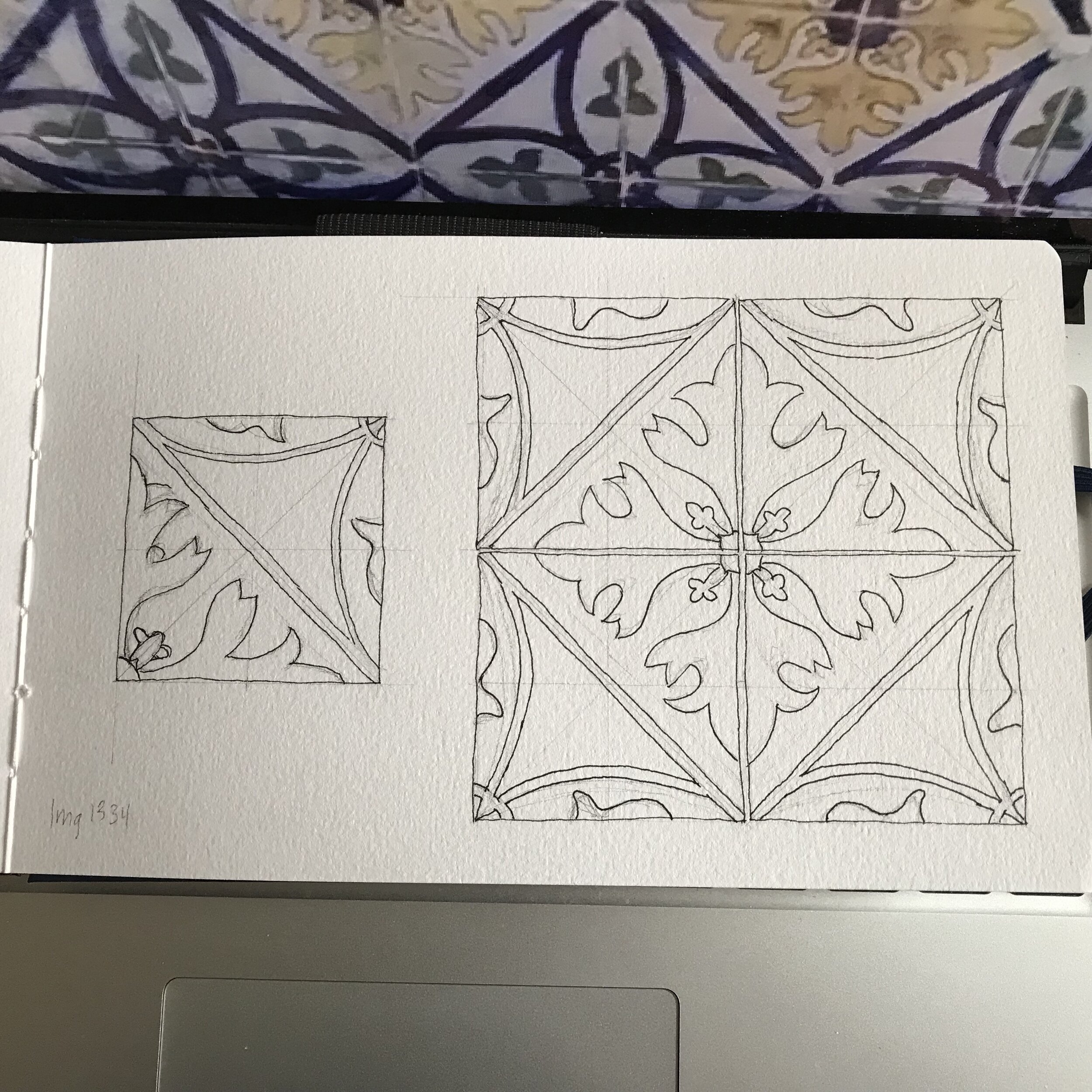
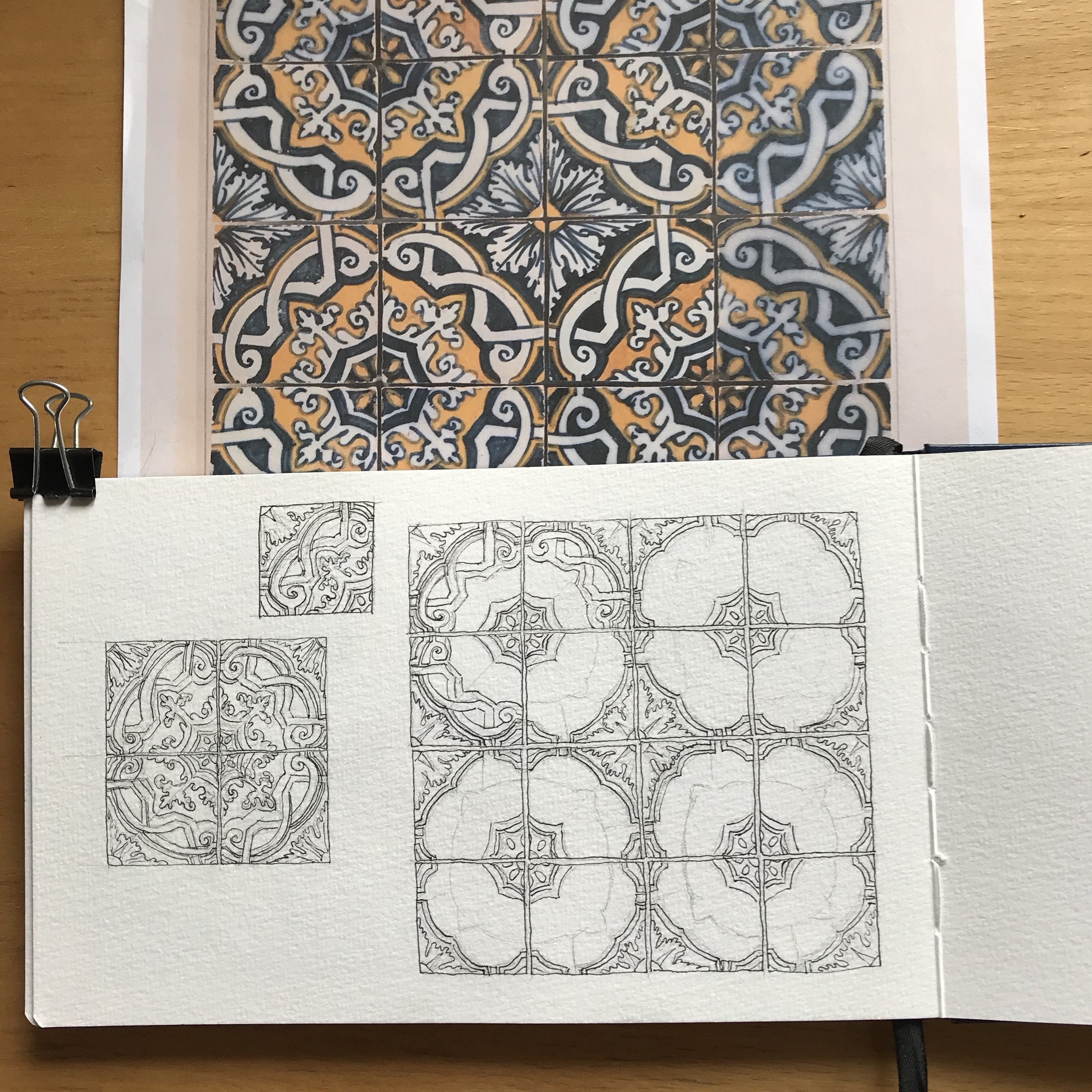
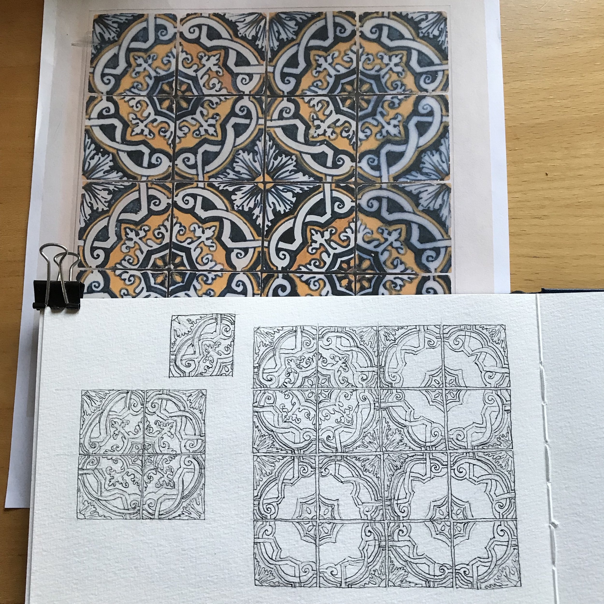
Here are some photos of the next stage in working on my Portuguese tile pattern. I’ve inked the four tile group but have left, for the moment, the pencil lines for you to see, both grid lines and approximate sketch lines that I adjusted in ink. I made some adjustments in the pattern between the inking of the solo block and the group of four. I saw different details as I looked over the wall of repeating tiles in my reference photograph. My next steps are to erase the pencil lines, scan the pattern, then paint.
The Process of Drawing Tile Patterns
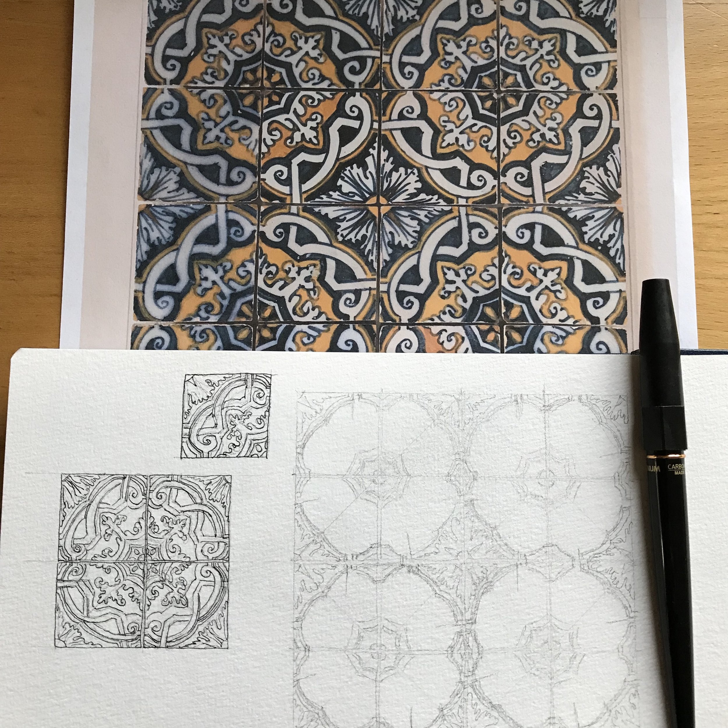
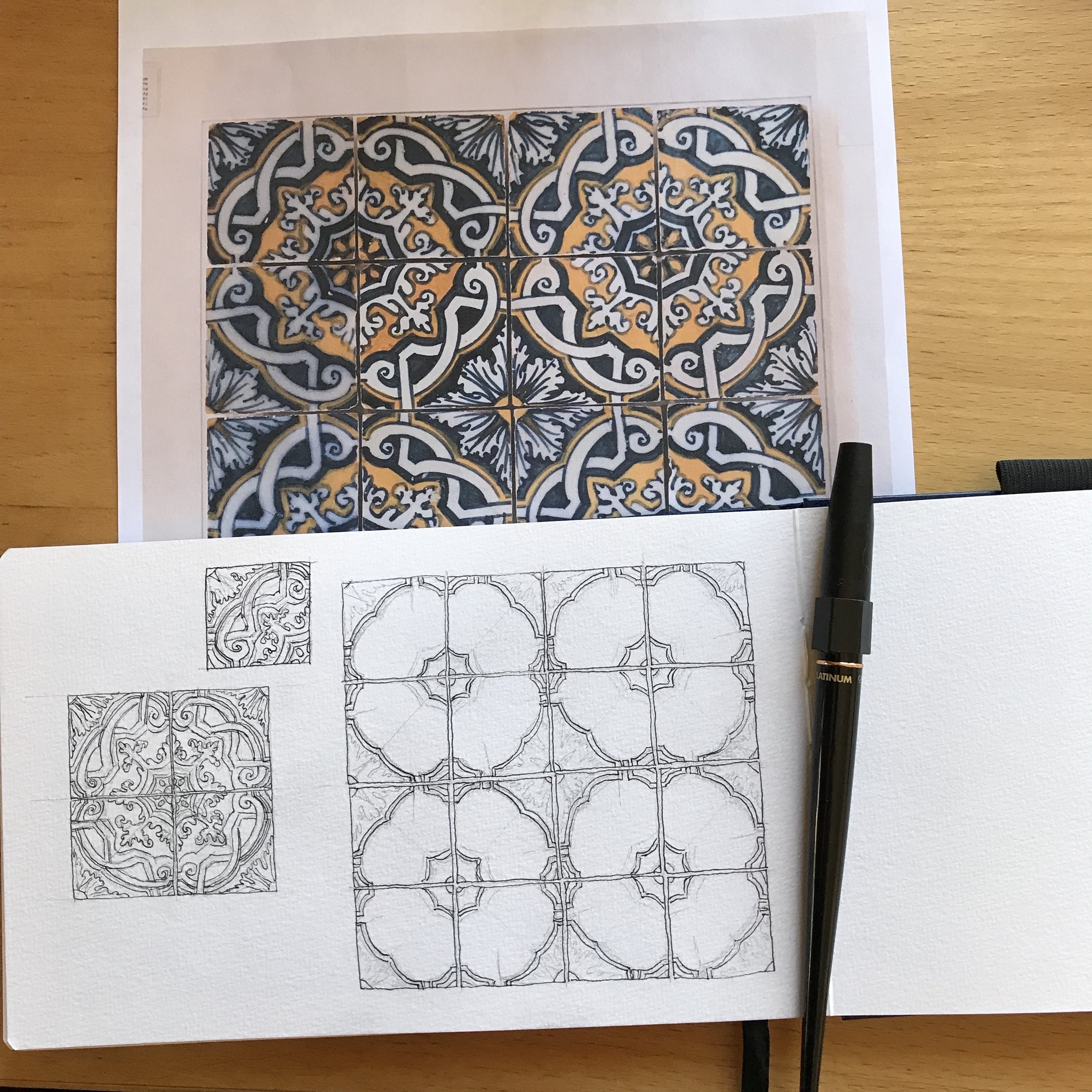
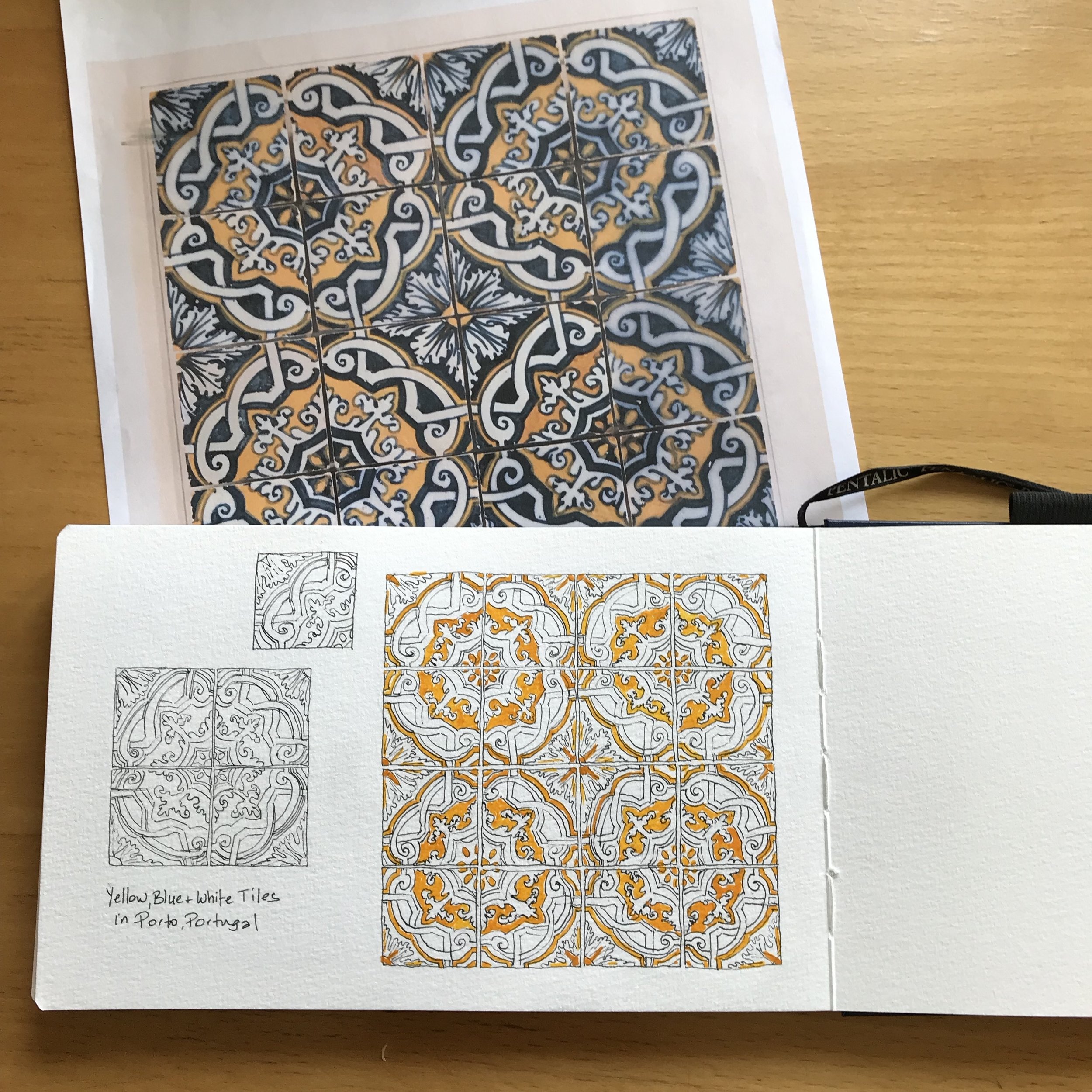
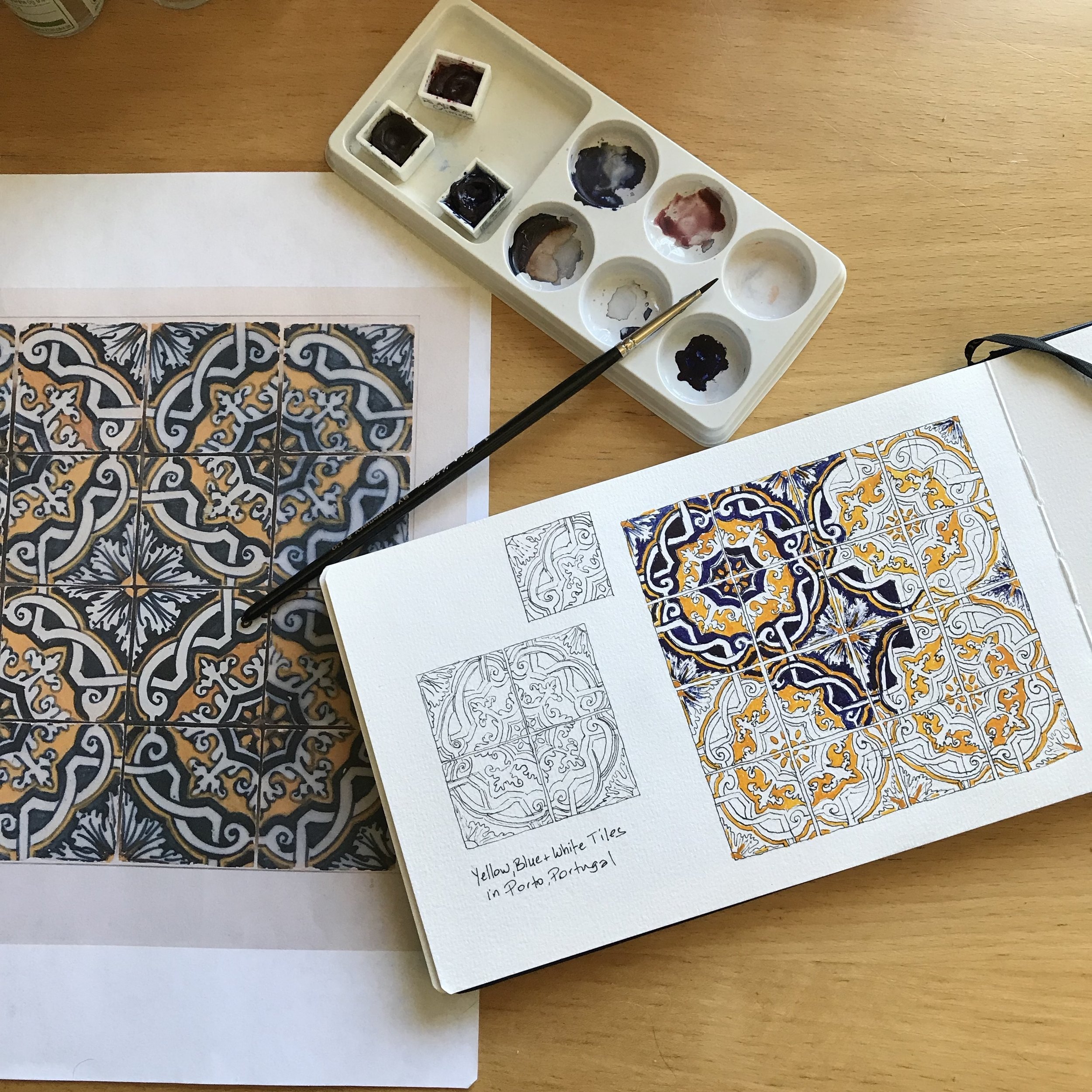
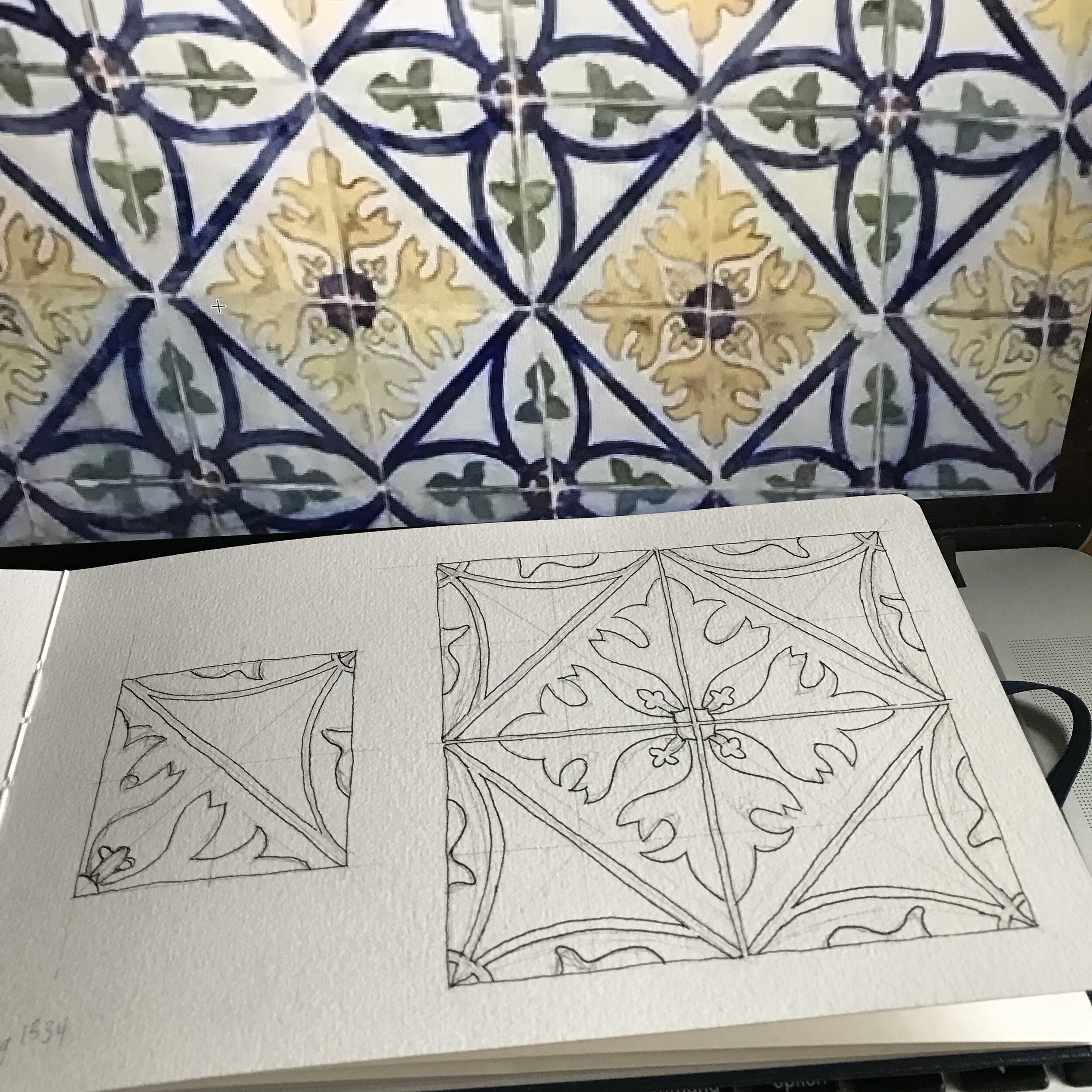
Recently I started adding color to my drawing of a Portuguese tile pattern that I saw at the National Tile Museum in Lisbon, Portugal last summer (although I wrote Porto in my sketchbook). I love the way one block pattern can be complicated enough that it takes 16 tiles to show it!
These are some pictures taken during its progress to being currently somewhat painted. I typically work on my projects about 30 minutes at a time. For these tiles, I start with a pencil and ruler and mark out on my sketchbook page where I’m going to place them. I like to draw a solo tile, then in a group of four, and then, here, in a group of sixteen to show the additional pattern that is made. I find the center lines and diagonals in each square and then start sketching out the pattern. Sometimes I will draw the whole pattern first then ink it, but here the design was complicated enough and my hand would rub off the graphite, I inked some parts before I did more pencil. Once the whole page was inked, I scanned it so I have it available for the future - I was thinking of a coloring book of Portuguese tiles. Then, I added color to match the tiles I had photographed.
It’s a time consuming but very satisfying process. I will continue to add blue watercolor to the rest of the drawing but I rather like partially complete painting too. I will scan that before I continue. Which do you like better - partially painted or fully painted?
Holiday Bazaars Begin

I am going to be a vendor at a couple of holiday bazaars this fall. The first one is on Saturday, November 17th at the IEOU Hall, 18701 - 120th Ave NE in Bothell from 10:00 am - 5:00 pm. I will have a variety of notecards and prints including my most recent Portuguese tiles. I will also have my quilted coasters and zippered bags available. Those are always so much fun to play with in person. I love to see people’s reactions to my coasters and how they want to touch and handle them - which is okay! Come out and support local artists and artisans at the My Friends & Me Holiday Bazaar!

I will be at the Redmond Cat (or Craft) Revolution, June 2, 2018

I will be at the Redmond Cat (or Craft) Revolution happening on June 2 from 10:00-3:00. It's being hosted by The Whole Cat and Kaboodle and Cafe Cocoa, in the lot next to the Redmond location where Grand Peking used to be. A portion of proceeds will be donated to help homeless and feral cats at the Feral Care Sanctuary located in Bothell. I will be donating a pet portrait commission for their raffle. Come and see and donate and maybe you can win that! There will be a variety of cat retail and craft vendors, and food trucks. Cats and food trucks! Some of my favorite things! Come by and say hi.
A Fish Print - Japanese Gyotaku

I was going through a shelf and came across some gyotaku - fish prints that I made a while ago. Never fear, no fish were harmed in the making of this print, nor was food wasted. I have a special fish form just for the purpose of making prints like this. The original was printed on rice paper which is soft enough to mold around the form, but strong enough to not tear when wet. Copies of this fish print are available in my shop and are up on various products in my Society6 shop.
Bitter Melon
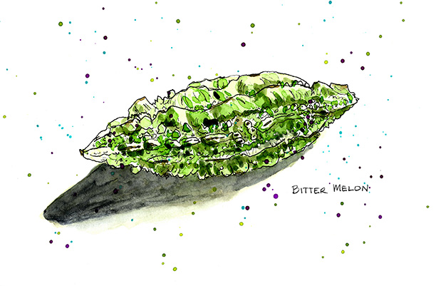
A bit of playing with my food. I went to an Indian food market a couple of days ago and had a fabulous time just looking at the fresh fruits and vegetables. I loved the bin of bitter melon and bought one to draw. I might eat it if I can figure out what to do with it! Know any recipes?
More color and color charts!
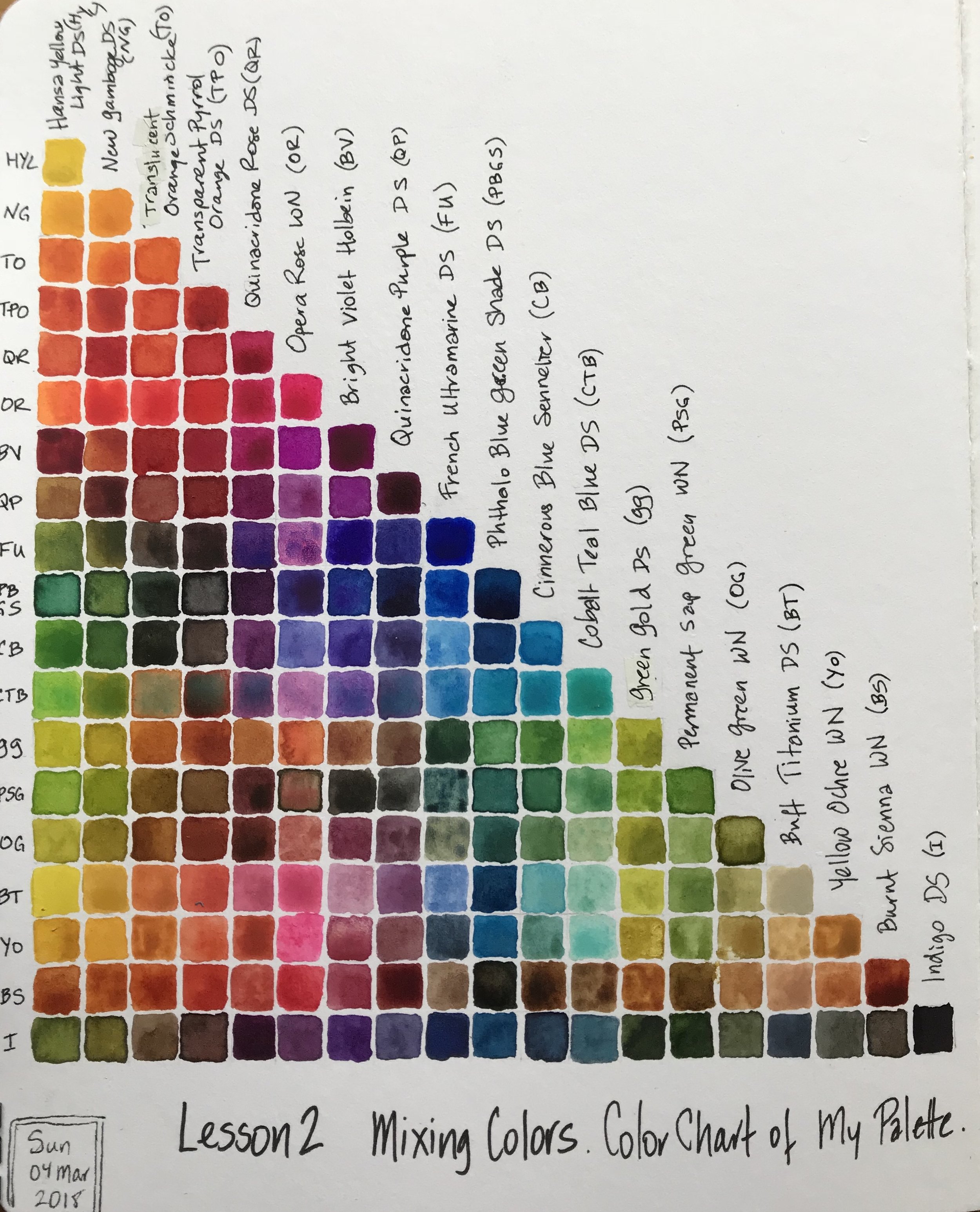
Recently I took an online course with Australian sketchbook artist and former architect, Liz Steel with her SketchingNow Watercolours course. She is an amazing artist and a very good instructor. I highly recommend her! I've taken several of her online courses and first came across her as an instructor in Sketchbook Skool, another source of great sketchbook courses online.
Liz led us through a variety of exercises with our watercolors to become more familiar with what our particular paints would do and things to consider when painting on location. One of the lessons was about mixing colors and the benefits of knowing certain combinations of color mixes before going on location so that when that kind of combination was needed it would be easy to mix rather than guessing. She suggested that we make a color mix chart of the paints in our palettes but it wasn't a requirement for the course since it does take a long time to do. However, I find making color charts a lot of fun and rather meditative, so here is my color mix chart of my current travel palette.
My paints are a combination of Daniel Smith (DS), Winsor & Newton (WN), Holbein, Schmincke and Sennelier.